About this Article
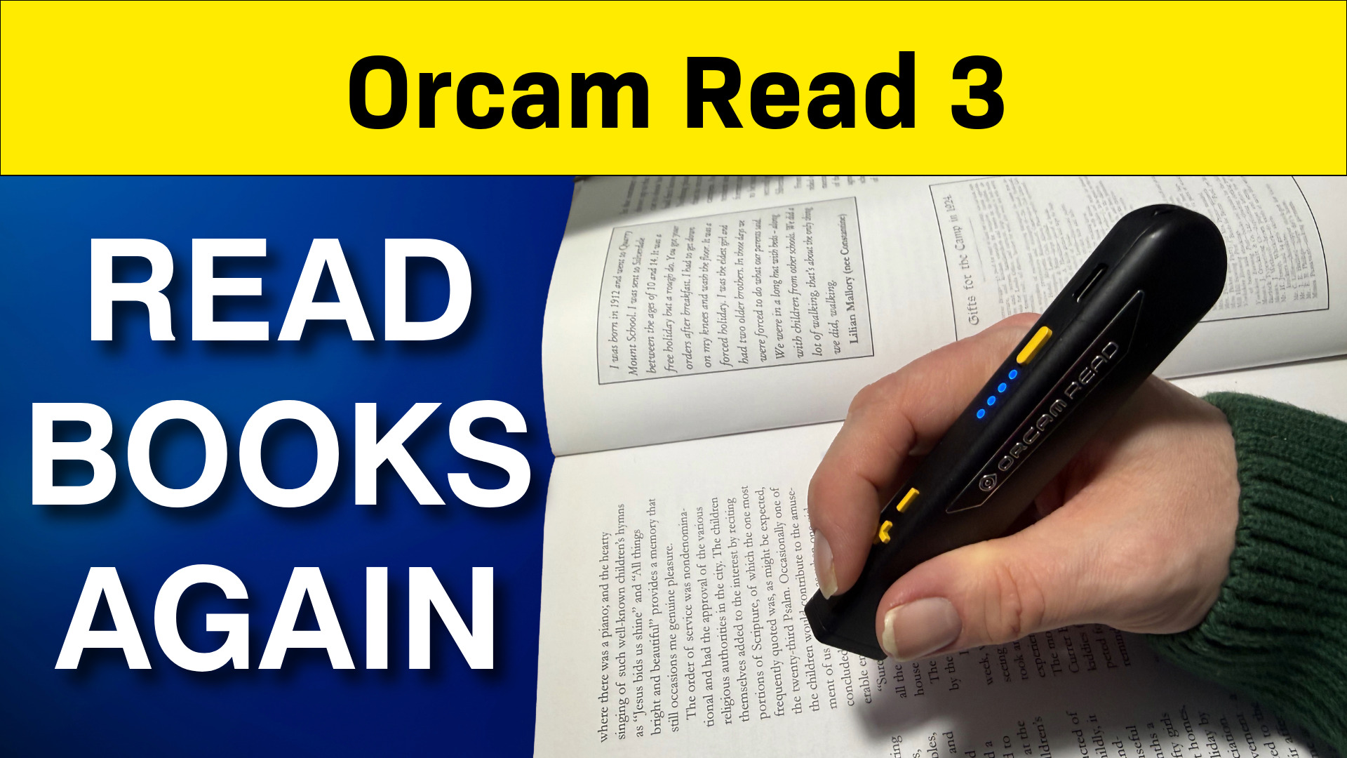
In our first video on Getting Started with the OrCam Read 3, I showed you how to get started with the device and how to read documents using the trigger button and voice commands. In this second video, I take a closer look at the OrCam Read 3 Smart Reading feature.
This is part two of a three-part series. In this video, I cover:
- Using OrCam Read Smart Reading to find specific information in a document
- Navigating documents with Reading Navigation mode
- Controlling your OrCam remotely using the OrCam app
- Testing the OrCam with a range of real-life documents and objects
AI Disclosure
This blog post was produced using AI. The original video was transcribed using AI speech-to-text software, and the transcript was then used to generate this article with the assistance of an AI writing tool.
Watch our Tutorial on using OrCam Read Smart Reading
A Quick Reminder About the Buttons
Before diving in, here’s a quick recap of the controls on the OrCam Read 3:
- Trigger button (round button on the left) — starts and stops reading. Double-pressing it pauses and resumes reading when you’re in Navigation mode, and activates voice control in other modes.
- Volume + and – buttons — adjust the volume, but also let you move forwards and backwards through a document when in Navigation mode.
- Power button — puts the device into standby and turns it on and off.
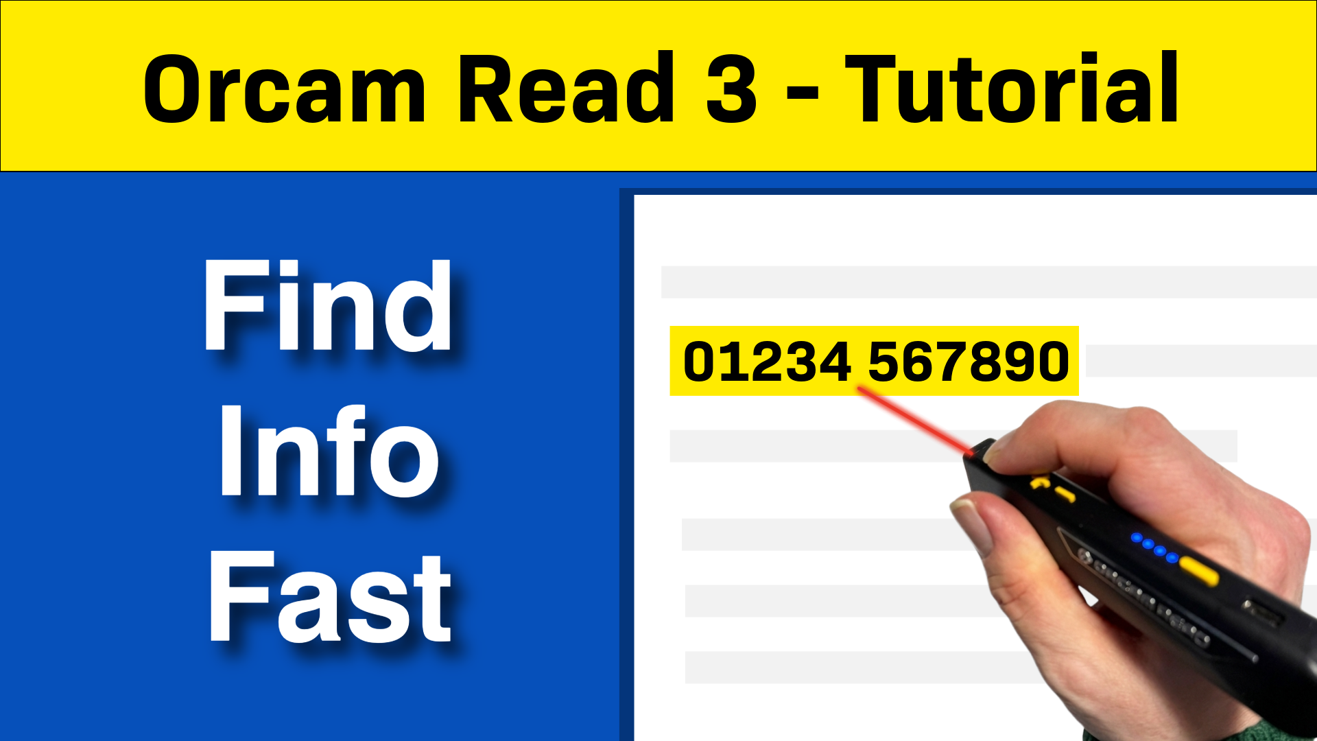
Using OrCam Read Smart Reading to Find Exactly What You Need
One of the most useful features of the OrCam Read is Smart Reading. Rather than listening to an entire document, Smart Reading lets you jump straight to the specific information you’re looking for — such as the date of an appointment, a phone number, or the amount due on a bill.
To enter Smart Reading mode, hold the OrCam above your document and either say “Hey OrCam, Smart Reading” or double-press the trigger button. Once it’s ready, you can ask it to find specific types of information, for example:
- Read dates — finds and reads out any dates in the document
- Find time — locates and reads out times
- Read phone numbers — finds any phone numbers on the page
- Find [word] — searches for a specific word or phrase, such as “find consultant,” and reads the surrounding text
- Read headlines — useful for magazine pages, lists the headlines it finds
- Read [article name] — asks the OrCam to read a specific article by name
- Read everything — reads all the text on the page
I demonstrate this in the video with a hospital appointment letter. Asking for dates, the OrCam quickly finds two — the date the letter was sent and the appointment date. It also finds the appointment time, location, and consultant name, and reads out the phone numbers listed on the letter.
Using OrCam Read Smart Reading with a Magazine
Smart Reading also works well with more complex documents. I scan a magazine page with several articles and ask the OrCam to read the headlines — it finds four and reads them out in order. I then ask it to read one of the articles by name, and the OrCam goes straight to it.
There are a couple of things to bear in mind. If an article runs onto another page, the OrCam has no way of knowing this, so you won’t hear the rest of it. Voice recognition can also be hit and miss — asking it to read the article about “age verification” didn’t work the first time, and I had to try a different approach.
Reading Navigation Mode
When you scan and read a document normally, the OrCam reads the whole thing from start to finish. Reading Navigation mode gives you more control — letting you pause, resume, and move backwards and forwards through the document.
To enable it, double-press the trigger button and say “enable reading navigation.” Once it’s active, you can:
- Pause and resume reading by double-pressing the trigger button
- Move back through the document by pressing the minus (volume down) button
- Move forward through the document by pressing the plus (volume up) button
- Stop reading altogether by pressing the trigger button once
To exit Navigation mode, double-press the trigger button and say “disable reading navigation.”
I use this feature in the video with an NHS information document — it’s very easy to move through the text at your own pace.
Controlling Your OrCam with the App
As well as the buttons and voice commands on the device itself, you can also control your OrCam using the OrCam app on your smartphone.
Setting Up the App
To get started, search for “OrCam” in your device’s app store and download the app. When you open it for the first time, you’ll be asked to allow Bluetooth — tap “Allow.” The app will then pair with your OrCam, which takes around a minute. Once connected, tap “Get Started.”
What You Can Do in the App
From the app’s home screen, tap Controls to access the main settings. From here you can:
- Adjust the reading rate (how fast the OrCam reads)
- Adjust the volume
- Access more settings, including reading modes, language, barcode and banknote reading options, and general device settings
You can also use the app to remotely control your OrCam. Tap Remote Control and you can start and stop reading, move forwards and backwards in a document, and adjust the volume and reading rate — all from your phone.
This is particularly handy if you want to sit back and have the OrCam read a document to you without needing to reach for the device. One thing to note: you can’t use the app to start a new scan. To scan a document, you’ll still need to press the trigger button or use a voice command.
Testing the OrCam with Real-Life Objects
I put the OrCam through its paces with a variety of everyday documents and objects. Here’s what I found.
Paperback Book
The OrCam handled both pages of an open paperback with no problems at all, even though the text was quite small. For best results, make sure you’re in a well-lit area when scanning.
Hardback Book
This was more of a challenge. The book was A3 size when fully open, with two columns of text and illustrations. When scanning both pages together, the OrCam read the first page fine but struggled with the second — particularly with text that was wrapped around an image, and it missed the last paragraph.
Scanning one page at a time gave better results. The OrCam picked up more of the text on the more complex page, and also read out the captions underneath the images. Both pages had a drop capital (a large decorative first letter) at the start of a paragraph, and the OrCam found this tricky in both cases.
Yogurt Pot
The OrCam had no trouble reading the main text on the front of a yogurt pot. However, it couldn’t read the stylised brand name, and it wasn’t able to pick up the expiry date.
On the side of the pot, it read the product description and allergy warning without any problems. The nutritional information was less reliable — a few values were read incorrectly, and it was sometimes difficult to tell which figure belonged to which nutrient. Slowing the speech rate down might help with this.
Ready Meal Packaging
I tested a Sainsbury’s Taste the Difference ready meal. The OrCam ignored the stylised logo on the front of the pack but correctly read the product name and description (though it did add a stray word at the end).
On the back, it missed the first line of text that spanned two columns, but read the cooking instructions well — the occasional misread word aside. The timing and temperature information was correct, which is what matters most.
Computer Screen
Many people might want to use the OrCam at an airport or train station to read departure and arrival boards. I tested this using a flight arrivals board displayed on a 32-inch computer screen.
On the smaller screen, the OrCam managed to read the table, though it got the column headers in the wrong order at first. On a 65-inch screen in a meeting room, standing about two metres away, it struggled — partly because the brightness of the screen made the laser lines used for aiming very difficult to see.
What’s Coming in Part Three?
In the third and final video in this series, I’ll be looking at:
- Connecting your OrCam to Wi-Fi
- Using the Summarise feature
- Using the OrCam web app as a video magnifier
- The AI features that let you have a conversation with your documents
- My overall verdict on the OrCam Read 3
Make sure you subscribe to our YouTube channel so you don’t miss it.
The OrCam Read 3 was loaned to us by Optelec for use in our resource centre. Under YouTube’s guidelines this is classed as a sponsored video, but we have received no payment. Neither OrCam nor Optelec were aware we were making this video, and neither had any editorial input.