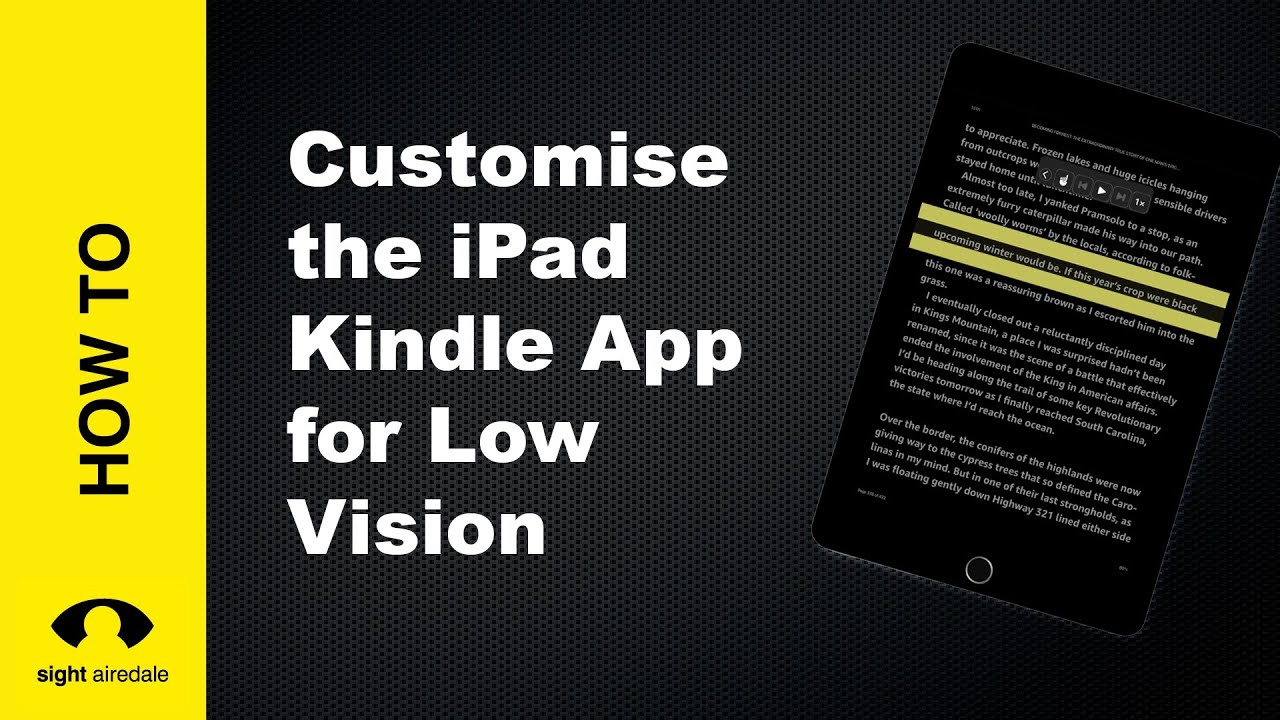
In this article, we’ll look at some things you can do to make the Kindle App on the iPad easier to see.
Watch our tutorial on making the iPad Kindle App Easier to see
Increase the font size
When adjusting the font size, don’t simply put it to the maximum. Instead, you want to strike a balance between a large font and enough words on one line to make reading comfortable.
Change the typeface
Many visually impaired people find reading sans-serif fonts such as Helvetica or Amazon Ember Bold easier than serif fonts. The serif refers to the little tail on letters such as T or a.

Change the theme
Many people find that there is too much glare when reading black text on a white background. The Kindle App for iPad has four themes, black on white, brown on sepia, black on mint green and white on black. Many people with Macular Degeneration find reading white text on a black background more comfortable. You can also adjust the brightness of the kindle screen independently of the rest of the ipad to help reduce glare.
Change text alignment to left aligned
Because of unequal spacing between words, many visually impaired people find fully justified text (text where both margins are straight) difficult to read. Once you reach the end of one line, it is harder to find the following line. Changing the text to left aligned gives a jagged right margin, making it easier to locate the following line.
Increase line spacing
Increasing the line spacing makes it easier for the reader to stay on the line they are currently reading without drifting on the line above or below.
Increase the size of the margins.
Many people find reading shorter lines more comfortable than reading long lines of text.
Use the Screen Ruler
The screen ruler helps the reader focus on the line they are currently reading. It also acts as place holder allowing the user to quickly locate their place on the page if they look away from the iPad. However, it does not remember the location on the page between reading sessions.
To access the screen ruler, tap anywhere on the screen, choose Aa and tap on the more tab, then select reading ruler and switch on the reading ruler. There are several ruler styles, so you can experiment to find which best suits you.

